Air Monitoring
A call for clarity from air quality information systems
Jul 10 2023
Airly is highlighting the need for caution when interpreting commonly used methods for displaying air quality data. With a mission to make air quality visible and understandable for all, Airly CEO Wiktor Warchalowski is concerned that the many different formats in which air quality data is presented can lead to confusion or even misinformation.
While the measurement values from air quality sensors hold great value for the public, their efficacy is greatly enhanced when displayed in a simple and easy-to-understand format. Governments and organisations use an air quality index (AQI) to communicate the levels of air pollution, enabling the public to grasp the current or forecasted air quality through a traffic light system. These categorisations are usually based on widely accepted norms and the latest research on the health effects of poor air quality.
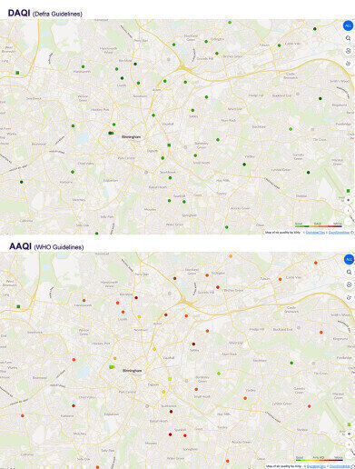
“An AQI is an excellent tool for imparting information without having to educate readers on specific pollution concentration values,” Wiktor explains. “The problem, however, is that several different AQIs exist around the world, and they all vary in the pollution levels that they regard as high, medium or low. Consequently, at Airly, we find that we can pass our sensor data through two different AQIs and create two completely different displays – from the same data, in the same place, and at the same time!”
As an illustration, in the United Kingdom, the Daily Air Quality Index (DAQI). established by Defra (Department for Environment Food and Rural Affairs), presents air pollution levels on a scale of 1-10, divided into four bands. Low pollution levels (1-3) are represented by the colour green, moderate pollution (4-6) by orange, high (7-9) by red, and very high (10) by purple. In DAQI, level 3 (low pollution - green) for fine particulates (PM2.5) is defined as 24-35 µg/m3 (24-hour average). In contrast, within the European AQI, 25-50 µg/m3 for PM2.5 is classified as poor air quality and depicted as red. The WHO (World Health Organization) has even stricter guidelines for PM2.5, with a new lower guideline value of 5 µg/m3 for annual average concentrations and a 24-hour average guideline value of 15 µg/m3 published in September 2021.
To face these challenges, Airly has recently developed the new Airly AQI (AAQI), based on WHO guidelines. The AAQI displays air pollution levels relative to WHO guideline values. For instance, a PM2.5 value of 15 µg/m3 corresponds to an AAQI value of 100, while a display of 500 indicates that PM2.5 levels are five times higher than the guideline value. In cases where multiple air quality parameters are measured, the AAQI displays the most harmful value, allowing viewers to gauge the severity of air pollution. The display encompasses six pollution levels, divided into ten different colour levels (see chart).
Summarising the issue, Wiktor Warchalowski emphasises, "The main objective of AQIs is to provide simple to understand information on air quality so that citizens can easily perceive three issues: (1) that one area on a map is more polluted than another, and (2) that air pollution today is better or worse than it has been in the past.
“These two pieces of information enable citizens to make informed lifestyle decisions, and all of the main AQIs meet that goal. However, goal (3) is to allow citizens, and especially those that are vulnerable, to determine whether current or forecast air quality is good or bad, and as has been demonstrated, this is where different AQIs can display apparently conflicting information.
“There are two solutions to this problem. Firstly, governments could agree on one universally accepted AQI; but air quality objectives and timelines vary internationally so this seems unlikely. The second solution is therefore mostly likely, and this is for vulnerable citizens to learn the absolute values for specific pollutants that represent a threat. It therefore falls on those of us that develop these systems to develop AQIs that deliver all three goals in a clear, and easily understandable way.
“Finally, when providing air quality data to citizens, we should remember that not everyone has constant access to an air quality website (or the enthusiasm to find it). For this reason, Airly’s monitors incorporate LED lights providing AQI information for passers-by.”
Digital Edition
AET 28.2 April/May 2024
May 2024
Business News - Teledyne Marine expands with the acquisition of Valeport - Signal partners with gas analysis experts in Korea Air Monitoring - Continuous Fine Particulate Emission Monitor...
View all digital editions
Events
Jul 30 2024 Jakarta, Indonesia
China Energy Summit & Exhibition
Jul 31 2024 Beijing, China
2024 Beijing International Coal & Mining Exhibition
Aug 07 2024 Beijing, China
IWA World Water Congress & Exhibition
Aug 11 2024 Toronto, Canada
Aug 25 2024 Stockholm, Sweden and online


.jpg)


