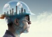
Air Monitoring
How Has Technology Mapped Air Pollution?
Dec 19 2015
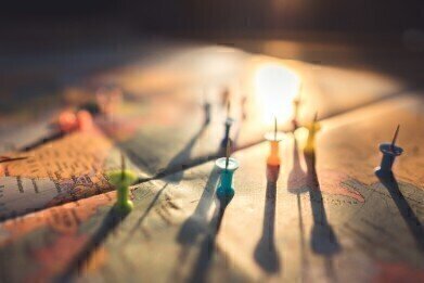
To coincide with the UN Climate Change Summit taking place in Paris over recent weeks, Plume Labs have released the first Worldwide Air Map. The interactive app takes data collected from over 150 monitoring stations in more than 40 countries around the world and collates it to create a global picture of the world’s air.
Plume Labs is a Parisian start-up company launched earlier this year by French innovator Romain Lacombe, whose initial intent was to make information available to the general public about the state of the air in individual cities. Based upon this data, people could then tailor their daily routines and habits to avoid excessive air pollution and thus lead healthier lives.
However, with the COP21 event taking place in November and December, Lacombe saw the opportunity to put his technology to a more global use. By creating the map, he hopes to inject a sense of urgency into how we approach the problem of air pollution.
How it Works
Air pollution apps are hardly a new thing – a similar app was developed to monitor air quality levels in London for the 2012 Olympics in order to safeguard the health of athletes competing in the games as much as possible.
Lacombe’s project is perhaps one of the most ambitious in terms of its global approach. Rather than simply concentrating on individual cities, Lacombe has attempted to give us a more comprehensive overview of the world’s air by highlighting which cities in particular are enduring poor air quality levels. With more than 150 monitoring stations dotted around the globe supplying real-time information to Lacombe’s app, we are able to see a map of world pollution.
Each station is denoted by a coloured hexagonal shape, with light blue indicating clean air levels and dark grey signifying hazardous levels of pollution. In this manner, users can see at a glance which cities and countries are contributing to global pollution more than others. If they are so inclined, they can click on each individual city and glean more valuable information about its atmosphere, such as a breakdown of pollutants present in the air, the number of days this year it has enjoyed such levels and advice on whether to partake in strenuous activity or not.
The Results
The findings from Lacombe’s project are fairly predictable. While the majority of Europe and North America report consistently clean levels of air, India and China are among the biggest offenders. But while the latter nation has signalled its intention to enter a new era in air quality monitoring in China, India has still yet to encounter a practical and practicable method of tackling its pollution problems.
Of course, the map is far from perfect. There are no monitoring stations in the entire continent of Africa, while South America and Australasia offer incomplete reports. Canada and Russia are also neglected areas.
But while it’s an imperfect picture of global air quality, it does at least give us an indication of which nations are enjoying good air, which are struggling with pollution levels and how to modify our own daily lives to avoid pollution as much as possible.
Digital Edition
IET 34.2 March 2024
April 2024
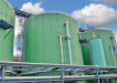
Gas Detection - Biogas batch fermentation system for laboratory use with automatic gas analysis in real time Water/Wastewater - Upcycling sensors for sustainable nature management - Prist...
View all digital editions


Events
Apr 30 2024 Melbourne, Australia
Apr 30 2024 Birmingham, UK
May 03 2024 Seoul, South Korea
May 05 2024 Seville, Spain
May 06 2024 Minneapolis, MN, USA